Visualizing Commute Times
April 24, 2017
A long commute is a soul crushing experience. A shorter commute is one of the top wishes for anyone looking to rent a new apartment or a buy a new house.
I’ve often wanted a tool to help me visualize commute ranges. How far can I drive in 30 minutes? How far can I travel by public transportation? I’ve never found a tool that could accurately show me. So I made it myself.
Source
Code
Demo: Removed due to Google API changes
It’s easy to get your own API Key through the Google Dev Console. You’ll then be able to run the tool on your own machine with your own daily API limit. See GitHub for details.
Case Study: Seattle, Washington
I’ve lived in Seattle for the last thirteen years. That’s where I’ll be demonstrating the features my tool has to offer.
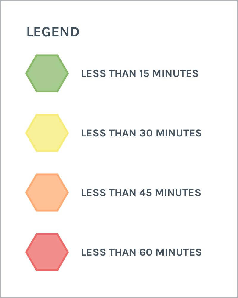
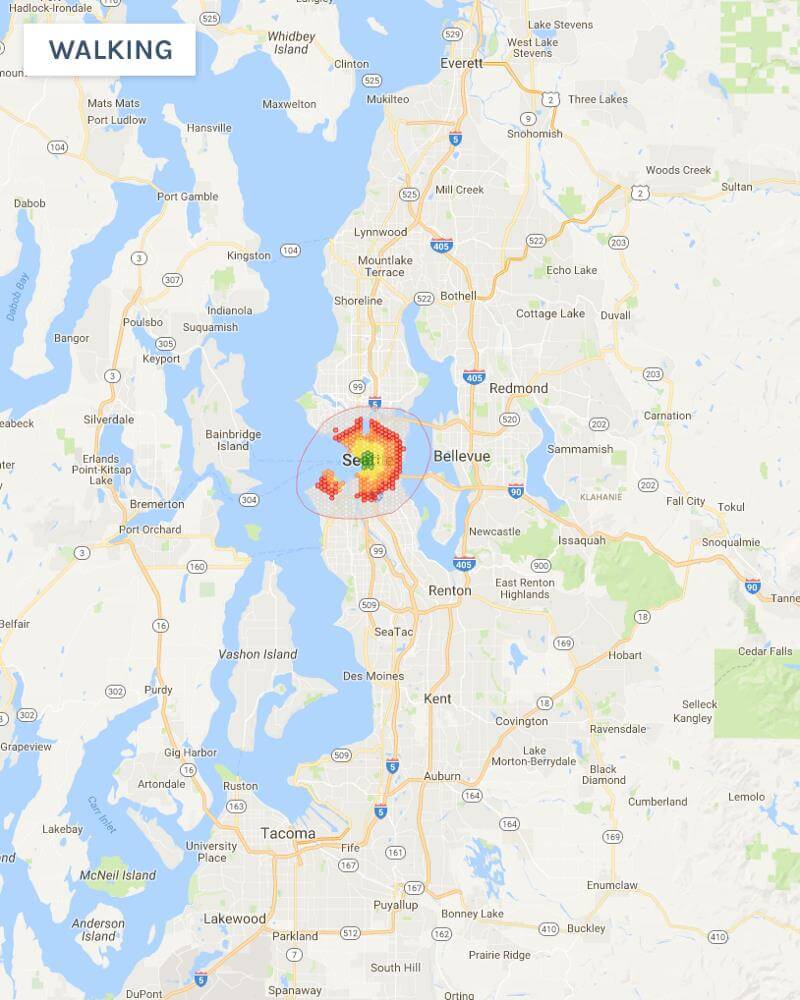
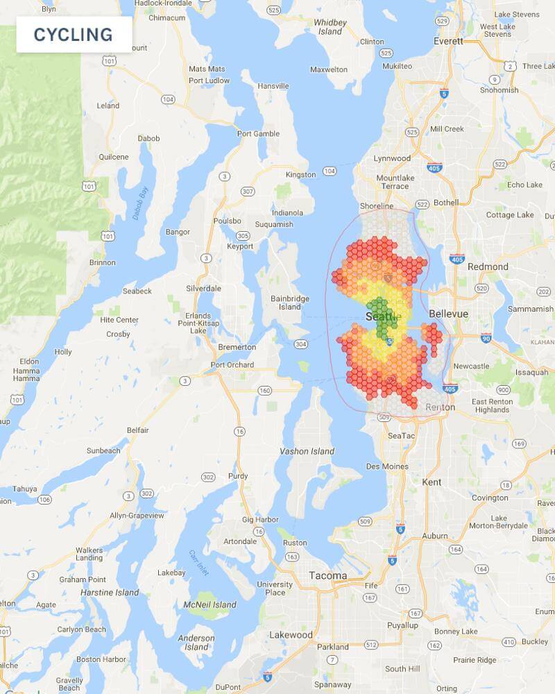
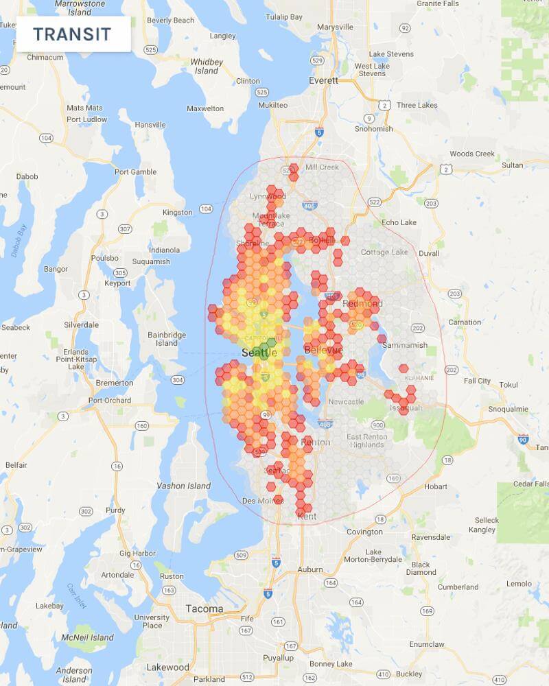
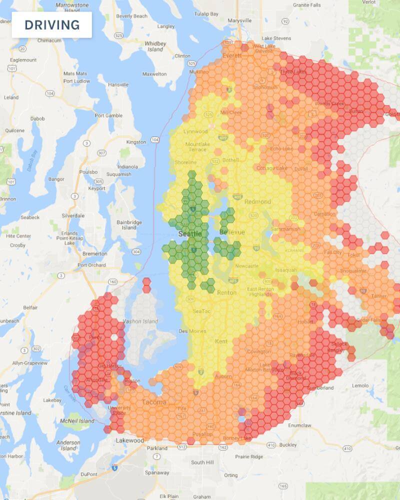
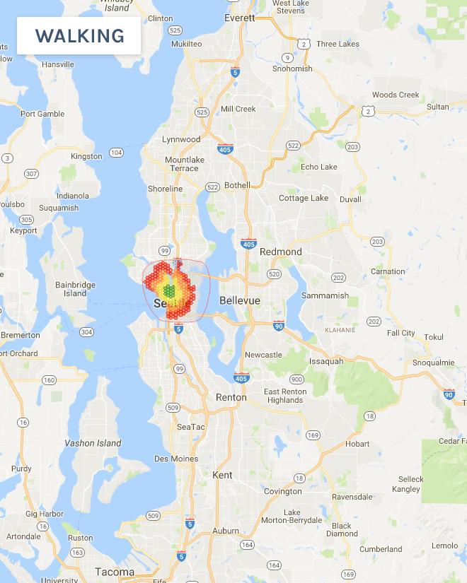
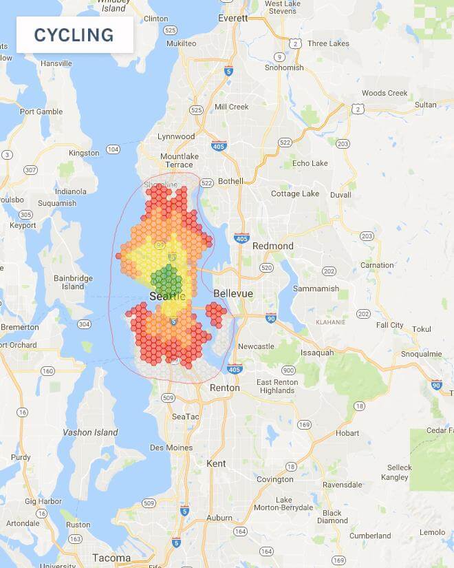
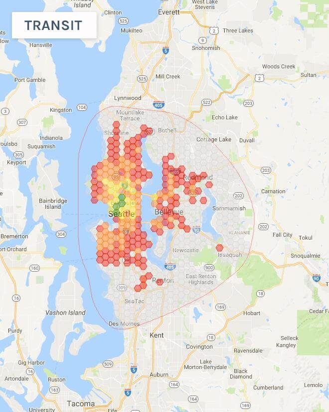
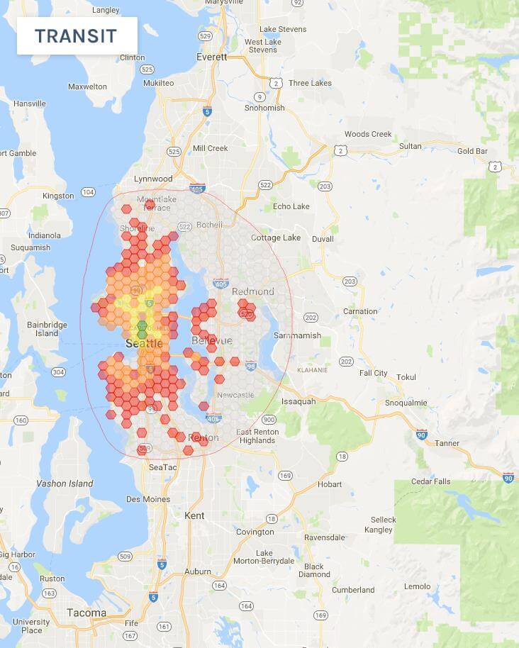
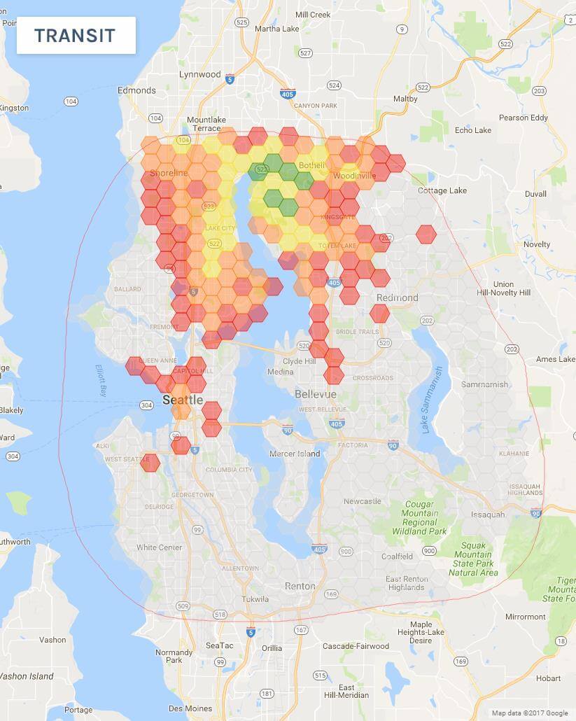
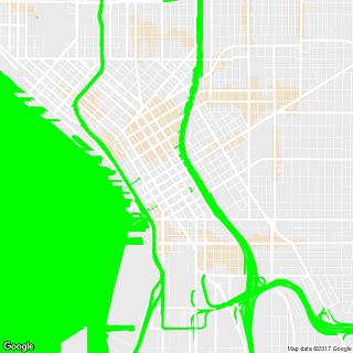
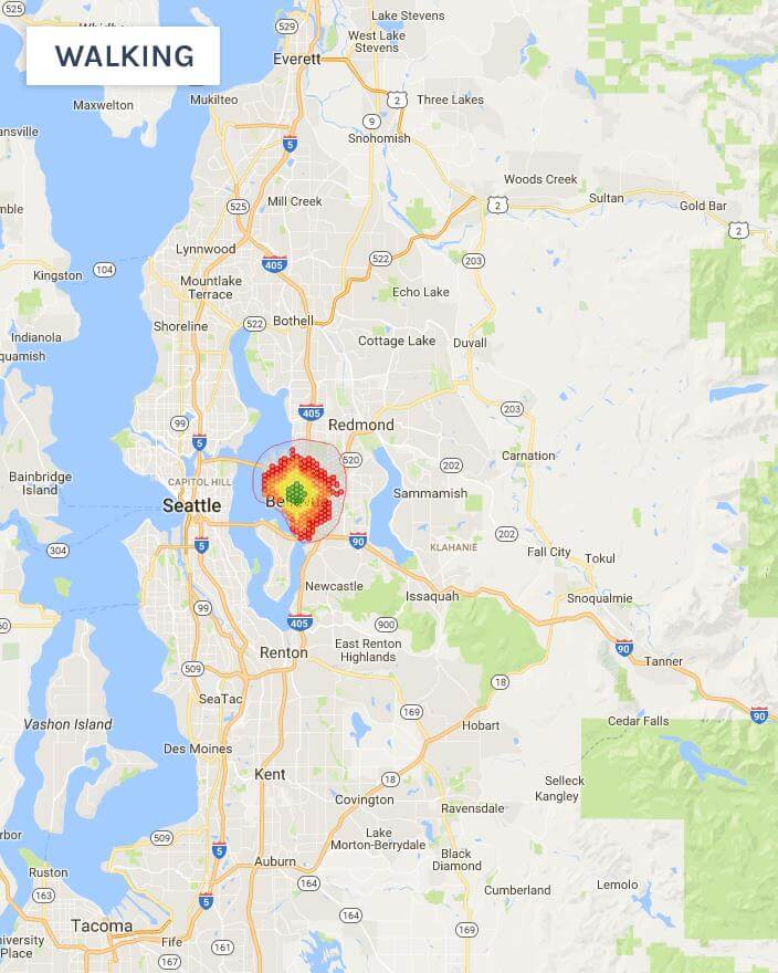
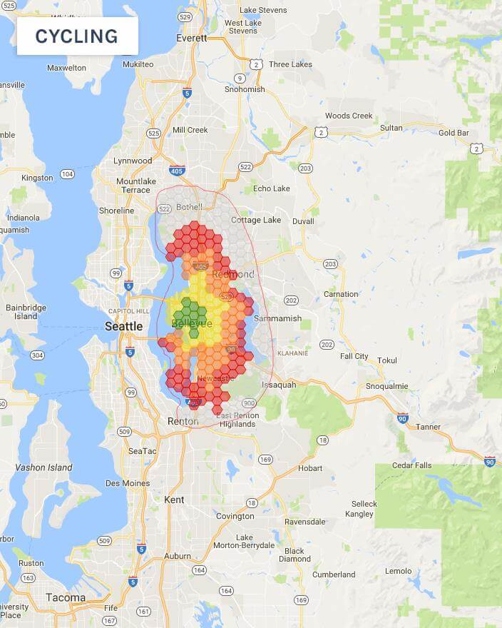
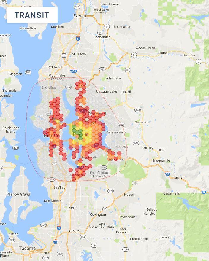
The following four images show how far you can travel from downtown Seattle by foot, bicycle, public transit, and car. Green, yellow, orange, and red represent a travel time of less than 15, 30, 45, and 60 minutes.
Traveling away from Seattle
These maps are about what you’d expect. Each mode of transport significantly grows the travel area in size.
Walking revealed a cool surprise. There’s an accessible patch of land across the water. At first I thought this was a bug! It turns out there’s a water taxi between downtown Seattle and West Seattle. I had no idea.
Transit access is irregular and splotchy. Islands of accessibility appear around scattered transit hubs. Express buses offer decreased travel time; but only along specific routes.
Rush Hour: South Lake Union
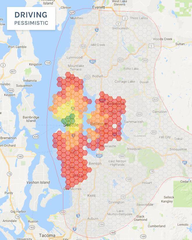
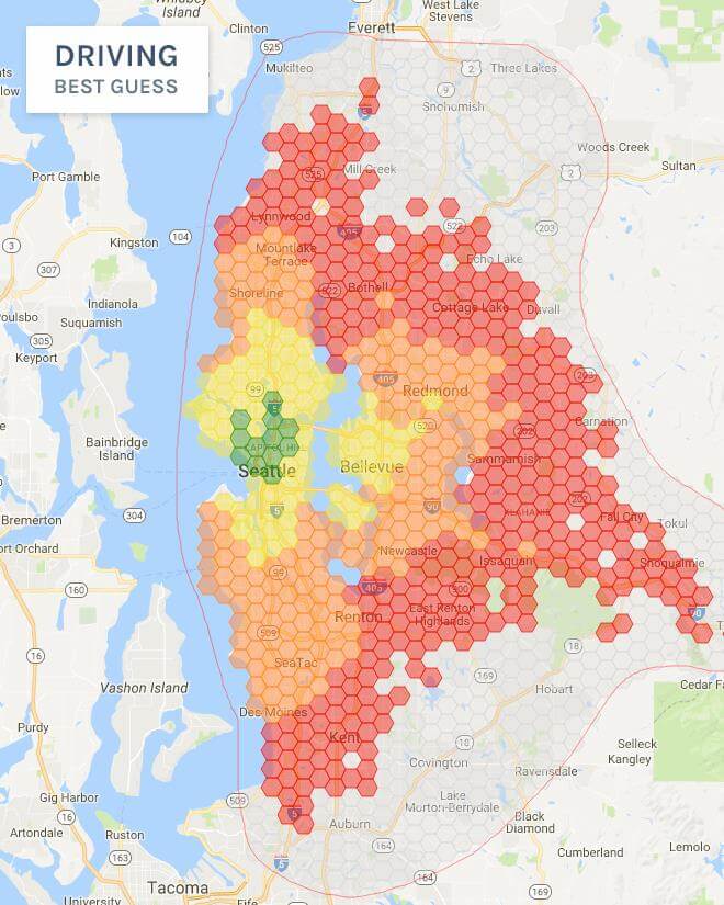
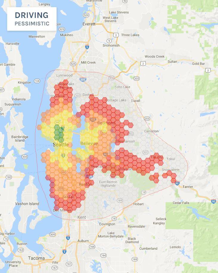
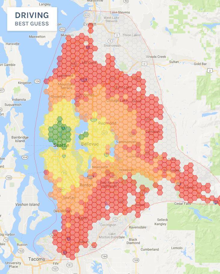
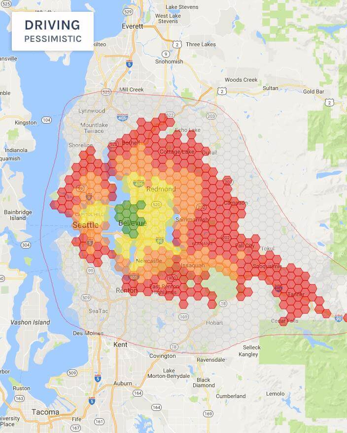
Astute readers may be thinking these maps are impossible. There’s no way you can drive that far in an hour. Not in the real world with real traffic.
You’re right! Fortunately Google offers a way to account for traffic. When driving you can specify what time you want to leave. For transit you can specify either what time to leave or what time to arrive by. Walking and cycling do not support time of day controls.
For this next set of images I’ve moved the destination slightly north to South Lake Union. This is the neighborhood where you’ll find offices for Amazon, Google, Facebook, and more.
If you want to work for Amazon this is what your commute will look like at 8:00 am.
Commuting to South Lake Union at 8:00 am
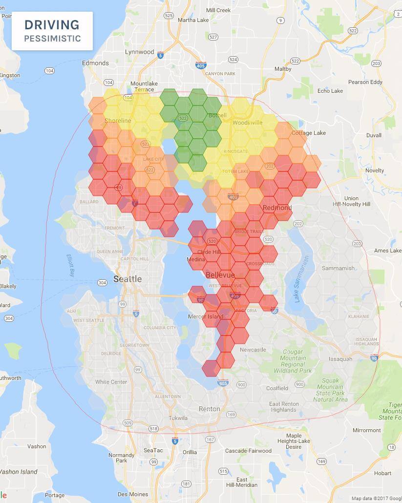
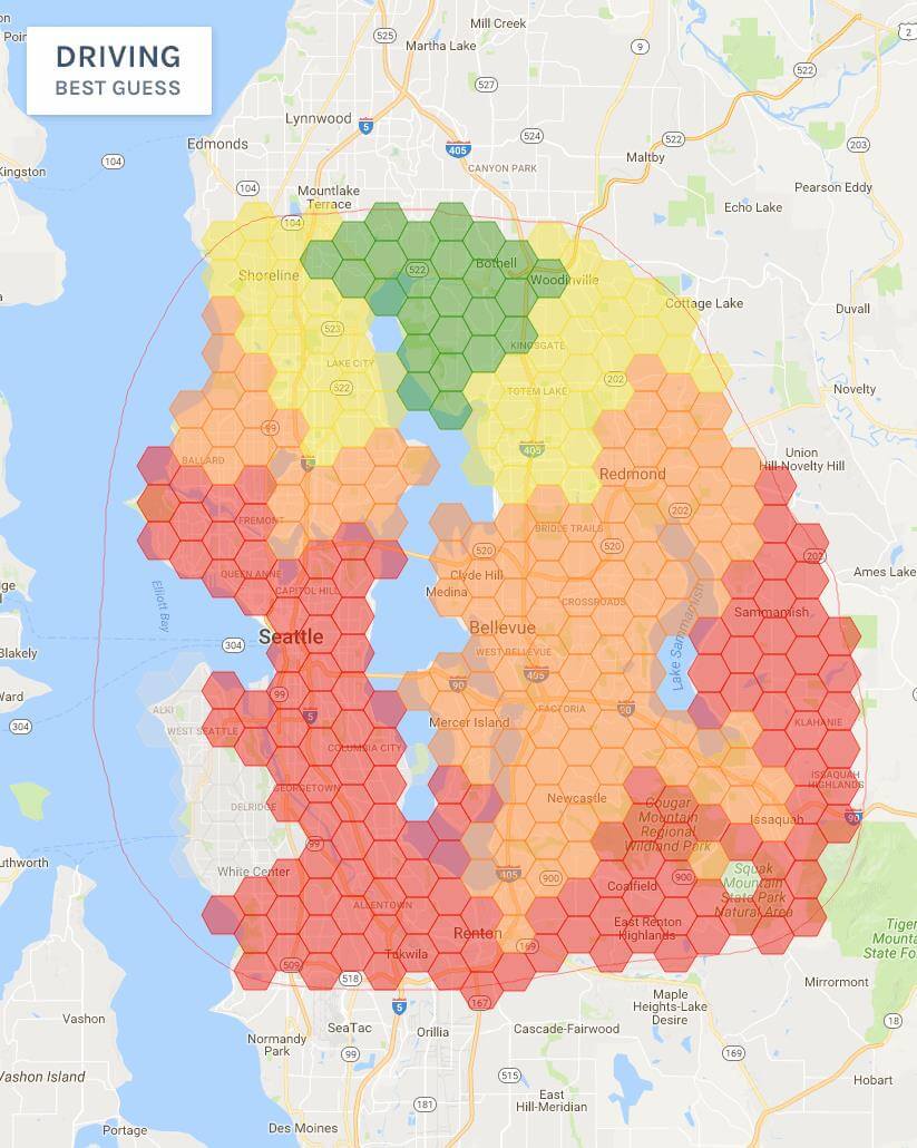
You’ll notice there are two maps for driving. When specifying a departure time for driving you can also set the traffic model; best guess, optimistic, or pessimistic. The difference between best guess and pessimistic is huge!
Seattle has awful traffic issues. My gut says best guess is a little too optimistic. But only a little. Maybe Google’s traffic data is stale. Pessimistic traffic days will occur, but only when there is inclement weather or a major accident.
You can also do a search that shows what your evening commute would be like leaving work at 5:00 pm.
Leaving work in South Lake Union at 5:00 pm
Suburban Commuting
If you aren’t familiar with the Seattle area there two sides; west side and east side, split by Lake Washington. The west side is the cool side with Seattle and Capitol Hill. The east side is the boring suburban side with good schools. Microsoft is on the east side in Redmond.
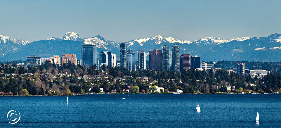
Bellevue Skyline & Lake Washington — Copyright — Marvin Heston @ Heston Photo
A few years ago I worked in Bellevue (east side) while my girlfriend worked in Capitol Hill (west side). We wanted to find a place to live where we could both have reasonable commutes. Not an easy task!
We found a place in Kenmore; right at the northern tip of Lake Washington. Even better, we lived 3/4 of a mile from a park and ride. Only a 15 minute walk or 3 minute drive to catch a bus.
Here’s what our commute range looked like, starting from the park and ride:
Commuting from Kenmore, Wa (Suburbia) at 8:00 am
To say public transportation options are lacking in the suburbs would be an understatement. And this is showing the morning commute from a great transit hub. It’s is as good as it gets. During off hours it’s even worse.
Quick Looks
Now that we’ve taken an extended look into Seattle I want to take a shorter look into a few different cities.
Paris, France
The inspiration for this post came during a trip to Paris last summer. We stayed in the 11th arrondissement and made heavy use of the subway network.
We also walked a lot. It felt that within Paris using the subway only cut travel time in half. An hour walk would still take 30 minutes by subway! I was on vacation so walking the streets of Paris to soak in the sights and sounds was fantastic. I highly recommend it! But it underwhelmed me in terms of commuting.
However that is just a feeling. We need to put it to the test. I picked the center of Paris and ran my tool.
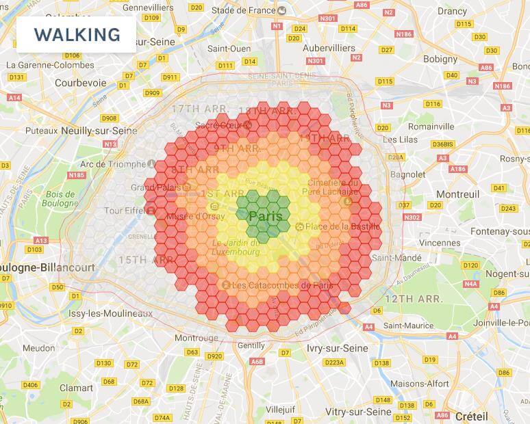
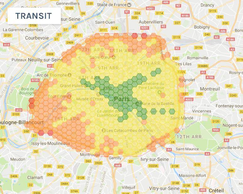
I was close. By foot you can get to most of Paris in 60 minutes or less. By subway you can get slightly further in 30 minutes or less. At least from the heart of Paris. The real time sink comes when you have to walk underground for 10 minutes to transfer.
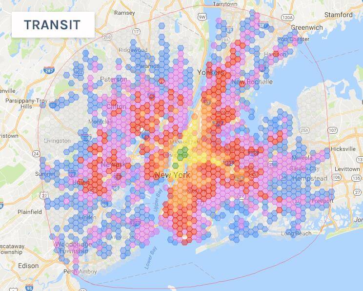
New York City, New York
New York City is America’s biggest city and has our biggest subway network. It also has the longest average commute time in the country.
For these maps I picked Rockefeller Center as the target destination.
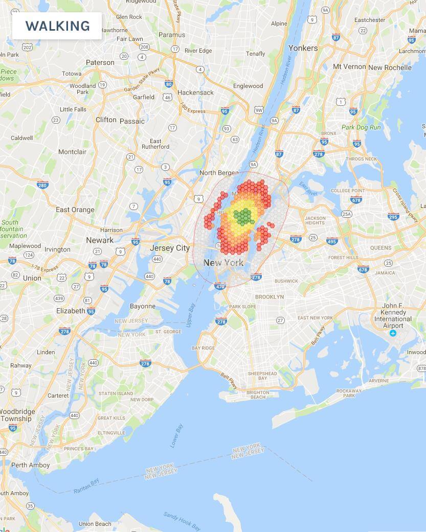
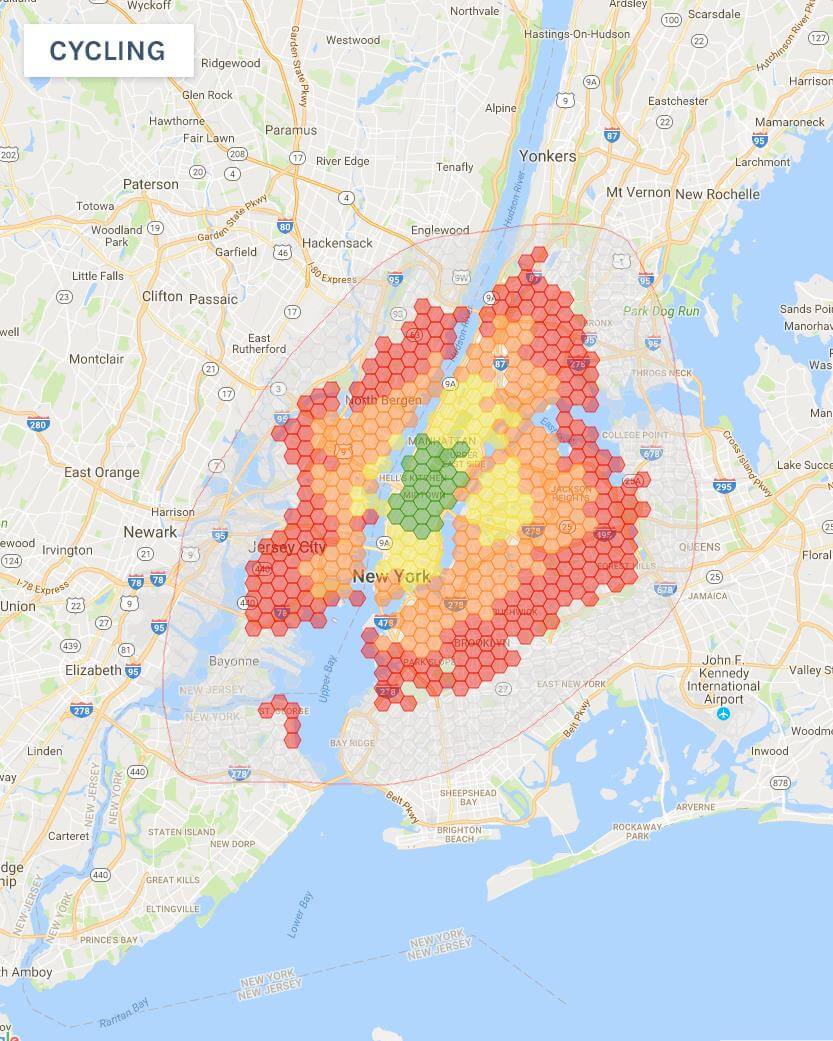
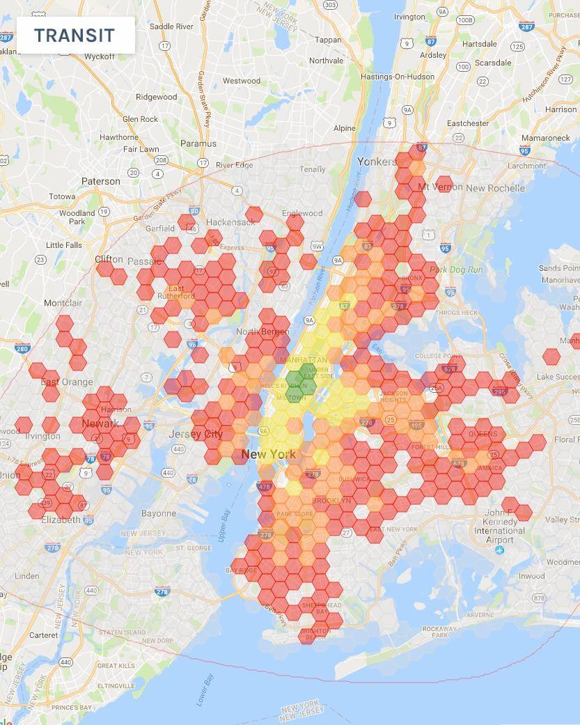
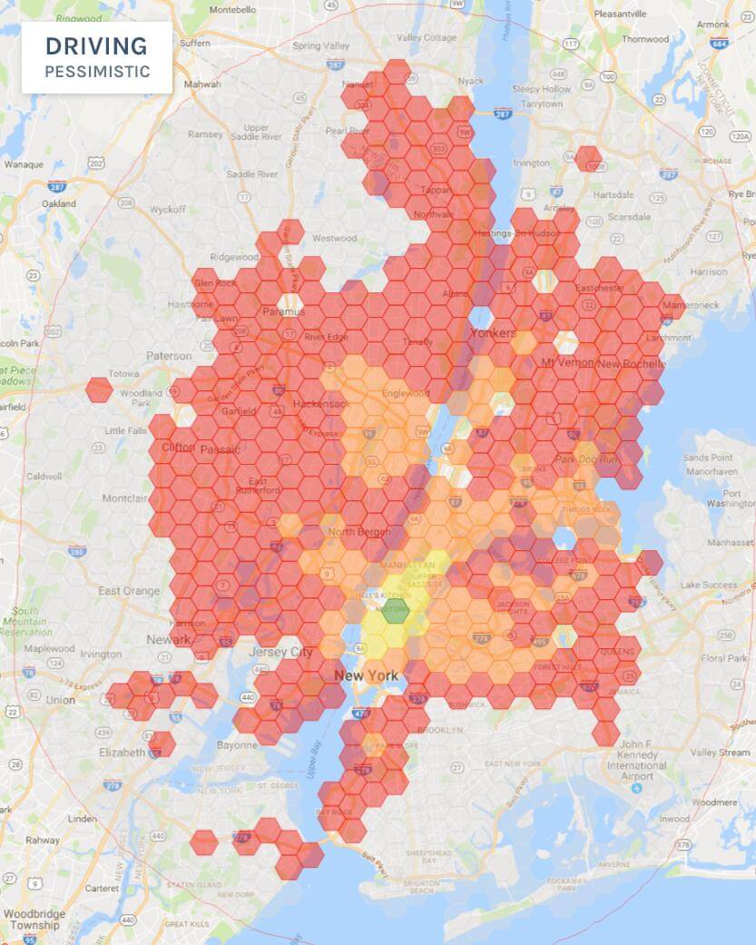
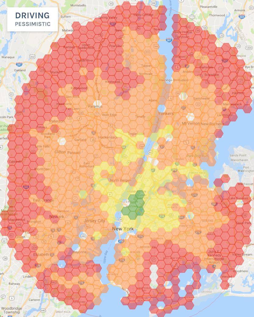
Commuting to Rockefeller Center at 8:00 am
I’ve never lived in New York so I don’t want to read too much into this. Transit access continues to be splotchy. In any city living near a good transit station makes all the difference.
Many New Yorkers commute longer than an hour each way. A New York case study should include 75 and 90 minute commute times. Poor Staten Island.
(Editor’s Note: Fifth image incorrectly says ‘Pessimistic’. It should read ‘Best Guess’.)
China scale never ceases to blow my mind. Looking at a map of Paris or New York I can eyeball the approximate range of transit. Shanghai is such a sprawling metropolis I lose all sense of scale.
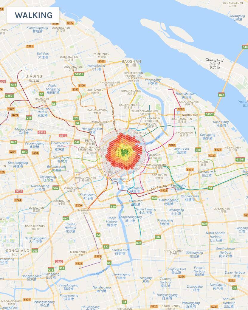
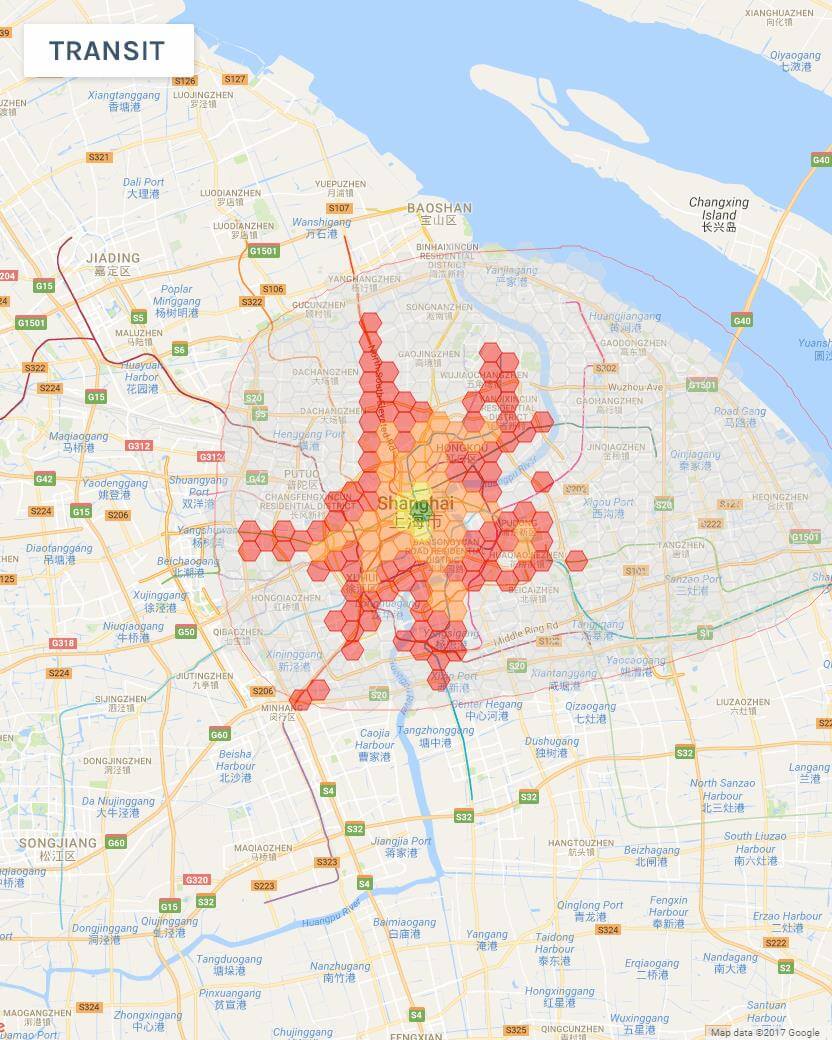
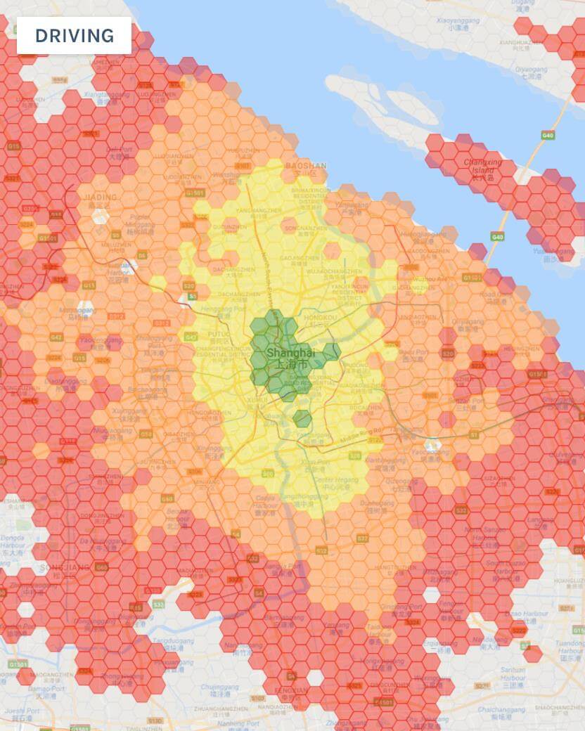
Commuting in Shanghai
For some reason Google doesn’t return any results for bicycling. To be fair I wouldn’t want to bicycle in Shanghai either.
These driving times do not take rush hour traffic into account. That information is not available in Shanghai.
International Caveat
My tool doesn’t work in every city in the world. It only functions where Google has data.
Much to my surprise, transit doesn’t work in Tokyo at all. I’ve also been told walking directions there are way off. Paris works, but has a few bugs caused by train tracks.
Basic directions and maps work in most places. Time of day controls to account for rush hour traffic are more limited.
For more maps check out the Bonus Gallery at the bottom of this post. I’d love to add reader submissions as well. Send me what you got!
Subjective Challenges
Now that we’ve seen some cool maps I want to briefly go behind the scenes.
One of my goals for this post was to remain mostly objective. With all this data it’s tempting to write an opinion piece. It’s almost hard not to! With so much data it’s trivial to build maps that support preconceived ideas.
With that in mind I have a thought I want to share.
Lies, Damned Lies, and Statistics
I previously wrote a blog post titled My Favorite Paradox. It’s a popular post about how well-intentioned, highly-educated folks can make honest mistakes that produce inverted results.
My second favorite paradox might be the Coastline Paradox.
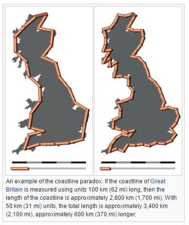
The more precisely you measure a shoreline the longer it becomes. I think the same is true for measuring commutes.
A bus commute isn’t the time it takes your bus to get from point A to point B. The door-to-door time includes 10 minutes of walking to the stop on either side. Plus 5 minutes because you get to the stop early because early buses don’t wait.
I think a more accurate measurement would be total time spent commuting per month. That would include random delays. Such as when you miss your connection and have to wait 30 minutes for the next bus.
Car commuters aren’t off the hook either. A monthly sum would include time spent in traffic because of ball games and concerts. Plus time added due to accidents, construction, and parking.
Sadly I can’t produce a map based on monthly commute time. It’d be an interesting study though. Especially if you compare actual commute time to what people claim theirs is. We may collectively waste more hours traveling to work than anyone realizes!
Future Work
There are a lot of ways to improve this project. There are a couple in particular I’d like to discuss here.
Census Data
It’d be really cool to combine my commute map with census data.
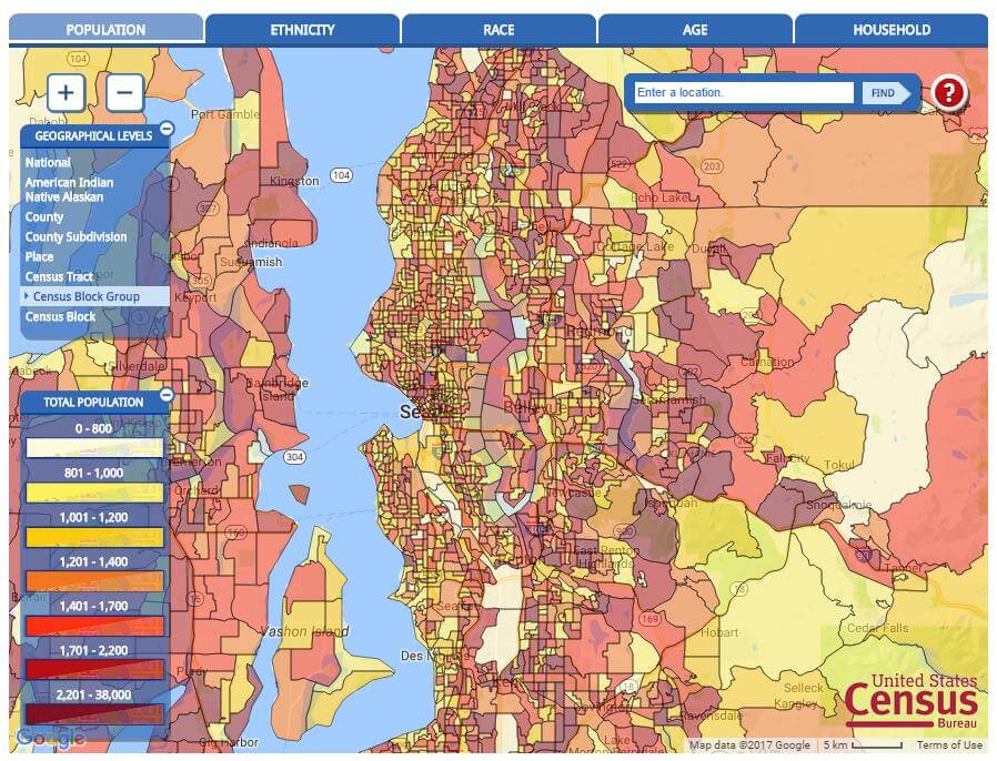
How many people live within a 30 minute commute of South Lake Union? What percentage of the population lives within 45 minutes of job centers? I have no idea. It’d be interesting to find out.
Do rich people or poor people have shorter commutes? Wait, I already know the answer to that.
Rendering
The technical term for this type of map is isochrone. A few folks on Twitter shared this beautiful isochrone map of travel from Paris by rail in 1882.
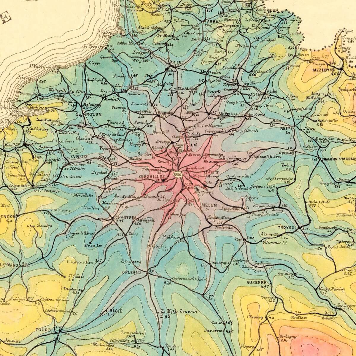
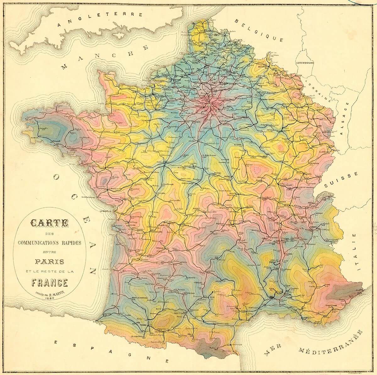
via TransitMaps
I’d love to spend some time making my maps prettier.
The hexagon pattern worked out great. I’d like to dynamically subdivide hexagons that lie on a border between zones. A few divisions plus smoothing might look even better.
Cost
My biggest issue is cost.
I use Google’s cloud services free tier. It has a daily limit of 2500 requests. A paid plan costs an additional $0.50 per 1000 requests. Each hexagon qualifies as a single request. The cost to generate a single map could be as much as $0.25!
I’ve released a public demo. My free tier daily quota can be eaten up in minutes. I’d love to make it more widely usable, but I don’t know how. Not at those prices. (Note: Removed due to Google API changes)
Conclusion
My tool does everything I wanted and more. My only regret is that API limits and cost prevent it from being more widely usable.
I’d love to see real-estate services such as Redfin and Zillow offer a polished version of this. It makes too much sense not to. Commute time is a critical factor when buying a new home.
I know urban planners and businesses pay for data like this. I’ve seen screenshots of data produced by consulting firms. I’m curious how my little project compares. I think favorably.
Full source code is available on GitHub. I encourage readers to build cool new things with it.
A bonus gallery is included at the bottom of this post. It contains a few more maps that I couldn’t squeeze in. Scroll past the technical challenges section if you just want to see pretty pictures.
Thanks for reading.
Bonus: Technical Challenges
I’m going to assume most people reading this post don’t care how this was made. For the few of you that do care I’m happy to share details.
Again, all source code is available on GitHub. It’s a single 1300 line file shared under a permissive license.
Google Maps API
This project is built on the mountainous shoulders of Google’s Maps API.
The key component is the Distance Matrix API. I provide twenty five origin/destination pairs at a time and Google tells me how long it takes to get there. With just that query you can imagine 95% of this project.
To perform searches using correct time of day I have to account for time zones. Google has, of course, the Time Zone API to do the heavy lifting.
Geocoding
I perform searches with latitude, longitude coordinates. The returned result is a fixed up street address. The problem is that fix-up might move outside the hexagon. This is a bigger issue in the country side than in cities.
The returned address could be verified by converting back into a latitude, longitude via Google’s Geocoding API. Unfortunately that can only be done one address at a time; Which is both slow and pricey. I think Google should include the latitude, longitude of the address in Distance Matrix results.
Detecting Water
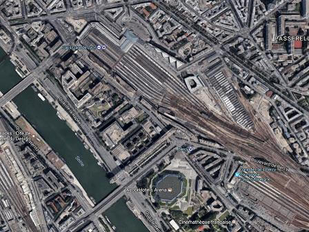
The only clever thing I do is for testing water. And it’s not even my idea! Eric Kerr, a gentleman and scholar, shared his idea.
The idea is to build a Google static map image that uses styling to draw the water green. Then you can test if a single pixel is green or not.
I take it a step further and turn both water and highways green. Here is what that looks like for downtown Seattle.
I found that highways screwed up my commute results. No one is trying to commute to the middle of the freeway! It takes time to take an exit and push through traffic lights.
If a sampled pixel is green then I sample up to four diagonal points inside the hexagon. The first to pass the test is used. If all four fail then that hexagon is skipped. This does produce a few “holes” which looks bad. There is room for improvement.
Step
I build the hexagon grid manually. It produces better results than rectangles.
Line drawing is mostly a matter of managing UI state. The line itself is just a list of points with a minimum distance between them. Google provides a way to draw polygons on maps.
To test if a point is in a concave polygon you cast a ray from the point in any direction. If it intersects with an even number of polygon edges then the point is outside. If it intersects an odd number of edges then it’s inside. My code does not handle rays that intersect parallel segments. Nor does it properly count rays which intersect vertices.
Large Scale
I built a test map to visualize travel times of 4, 8, 12, and 16 hours. It mostly works. The hexagons become misaligned. I blame Mercator projection. A different rendering approach needs to be adopted for this to work well.
Train Tracks
If you look at the Paris map there are a few weird red spots. Those are near train tracks. They should get filtered out like water and highways. But they don’t. I think Google may have incorrect markup?
Bonus Gallery
I made a few maps that didn’t quite make sense to include in the main body of this post. They’re presented below with minimal commentary.
If any readers would like to use my tool to create maps of their own I’d love to see them! Contact me via e-mail or Twitter and I’ll add them to the bonus gallery.
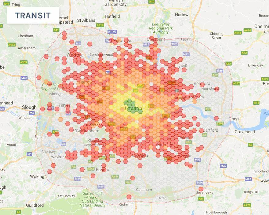
London, England
The extensive “tube” network of London.
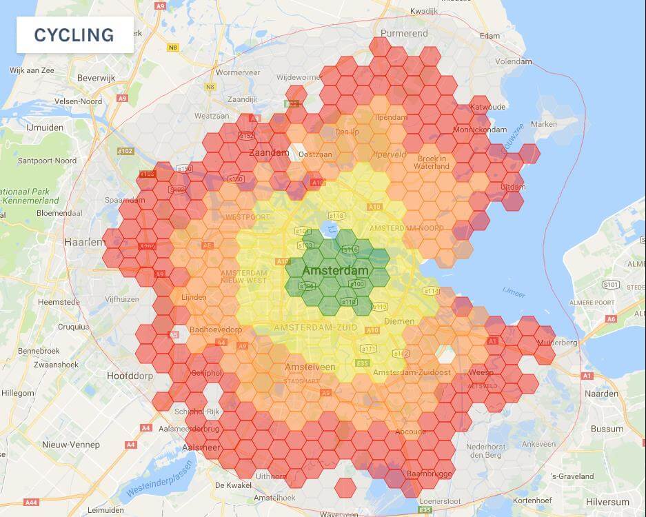
Amsterdam, Netherlands
Amsterdam is world renown for it’s bicycle friendliness. I thought this one would be fun to see. Sadly there are no surprises. It’s pretty straight forward.
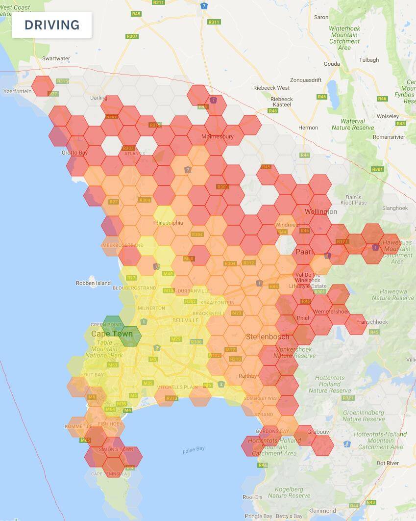
Cape Town, South Africa
Cape Town does not have traffic data. However any city with navigation can still support a basic map. It just doesn’t reflect rush hour.
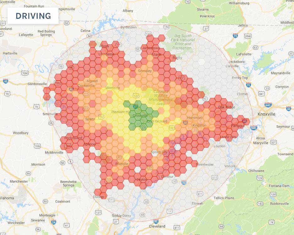
Crossville, Tennessee
This is my blog post and I can post whatever I want. Here is my childhood home in rural Tennessee.
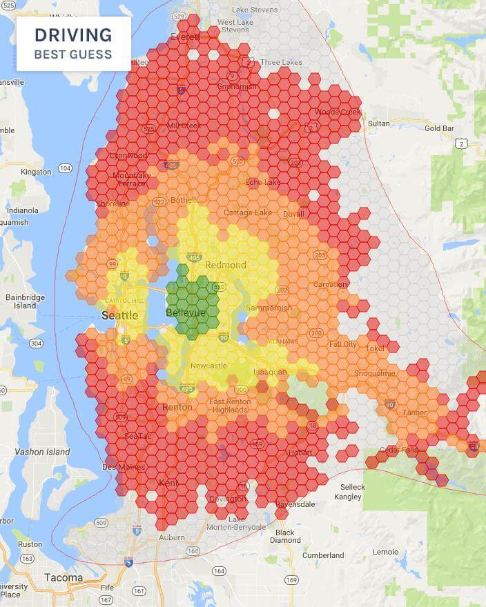
Bellevue, Washington
I work in downtown Bellevue. It seemed wrong not to give it the full treatment
New York City, New York
I couldn’t resist charting the 90 minute commute range for New York. In this image purple and blue represent 75 and 90 minute commute times.
I had to slightly crop the full range off due to precision issues. I need to make some pretty big code changes to support zoom levels this far out.